Tuesday, March 29, 2011

Favorite Artist {s}

I figured I would throw this in because it was a class day, but we never had an assigned reading for this day so I didn't really know what to do. Either way here it is. My art influences are more of a combination of modern street art coming out and classical masters that I have come to appreciate and admire. First and foremost my favorite classical artist would have to be 
Michelangelo.


His piece here David is amazing. I admire him for his ability to not only sculpt like a master, but to paint as a master too. A beast of a man.

moving more into what we have studied this semester, I feel that Frank Stella is one of my top artists. I love this guy.


Drawing from my early influences, one of my first art idols was Blaine Fontana. He inspired me to get into mixed media and experimentation in art. For sure I owe much of my own style development to this guy.


Jason Sho Green inspired me with his simple sketches and commentary in those sketches. I feel that he has influenced my work the most out of any other artist.


Jeremy Fish has also inspired me to sketch the way I do and illustrate emphasizing a lot on the graphic side. 


Ferris Plock is a guy that I have recently been following. I really admire his clean lines and fine detail. I also love his ideas on subject matter and character development. 


Shepard Fairey has influenced my graphic art more than anything. I love symmetrical designs and strong lines combined with delicate patterns and details with minimal colors to create that propaganda type of feel. I feel that graphic design needs to be strong with heavy emphasis on the message it is trying to communicate. I like that his art does this.


Finally RETNAxEL MAC. These guys are just pure inspiration to me. I love how they combine the realistic human figures with the strong graphics to tie together a piece. I was really into graffiti in high school, but I didn't always like the typical tagging type of art, I enjoyed the words being mixed with a picture more. I love the language RETNA has created.


Doing it big boys.
Enjoi

Post-Minimal/Post Modern Seventies

I really loved this minimalist stuff! Frank Stella, Jules Olitski, and Morris Louis are do it big. I can relate much more to their style and visual message than I can with some of the other pieces that we have studied.


Jules Olitski, Draky. 1966. American. Just look at it! I am sure anyone could come and say that anyone can do this piece. I then respond "No... YOU CAN'T." The piece looks so simple, but it is really well balanced and thought out. I think thats what I love about it. I also love the blended colors and the calm effect it give you.

Favorite by far would be Frank Stella's black paintings. This one is untitled but it was painted in 1964. American. I love the movement the lines create. I love everything about this piece and the other ones he did in the black series. No words literally no words. LOOK AT IT!!!


Finally Morris Louis, Claustral. 1961. American. I like this one because it is so simple. I love simplicity. I love the running lines that just ooze off the painting. Morris Louis doing his thing.

Postwar European School: L’Art Informel, Expressionist Figuration, Welded Sculpture


Barbara Hepworth Pendour 1947-1948. England. I like this piece because of the smooth wood finish and the contrasting white interior and her use of space with the holes. Its balanced and relaxing.


Barbara Hepworth Dyad 1949. England. I like this work because it is two figures embracing. It can be seen from either side and it appears the same. Her use of the spaces in the holes actually ties the figures together.


Henry Moore Nuclear Energy 1967 University of Chicago, Chicago, Illinois. I like the smooth top and the rough bottom pillars. I like the shape that it takes, almost like a mushroom cloud or a skull. I like the use of empty space used in the sculpture to give it balance.
enjoi

Abstract Expressionism and the New American Sculpture


So this is Landscape by the late great Hans Hofmann painted in 1941. Hans was a German-born American who immigrated to New York in 1936. I like this piece cause it looks like salad.


 Kind of the same thing right? I mean just look at it.


This bad boy was done by Franz Kline in 1950. Its called Chief.  Its an American painting and actually has nothing to do with indians. Chief is the name of a locomotive that Kline was familiar with when he was a child. I guess I can see that. I just really picked it cause it looked like a robot to me. 


So Jackson Pollock No. 5, 1948. American. Does it really matter what Jackson Pollock I put on here? Lets be honest they all look the same to me. I like this one though. It would make for a nice background for another painting. I like the randomness of Jackson Pollock's work and that each piece however planned he may claim it to be really comes out the way the paint falls. Everything is unique and can not be duplicated. Big ups to my man Pollock.


My boy Jackson doing it big.


so much swag.
Enjoi.

Architecture

Can't talk architecture without talking about Gaudi. Actually that is the only guy I want to talk about. I really like his style and his bold imagination. I just really want to focus on him.


Antonio Gaudi La Familia Sagrada Barcelona, Spain. 1882. This basilica won't even be finished until 2026. That will be 144 years in the making.


Antonio Gaudi La Casa Mila o La Pedrera Barcelona, Spain 1905-1910. I like how all the chimneys look like abstractions of people.


Antonio Gaudi, La Casa Batllo. 1877 restored in 1904-1906. Barcelona, Spain.
This house is beast. I love the spine like roof on the top.


I mean would you look at it! Looks like a stegosaurus on a roof!


Just some of the inside.


Future Gaudi right here! Keep the dream alive kid.


Enjoi.

Tuesday, March 8, 2011

Surrealism and Edward Hopper

So I'm not a huge fan of some of the traditional surrealist artists so I focused more on the International abstraction between the wars. I really like Edward Hoppers paintings.


Edward Hopper Sunday painted 1926 now hangs in Washington D.C. in the Phillips Collection. I chose it because of the color use and the almost impressionistic style. I really like old people too and just the mood this painting presents.


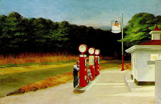
Edward Hopper Gas 1940 hangs in The Museum of Modern Art in New York. This piece is something I can understand and speaks to me especially right now. Gas prices are ridiculous right now. This painting is talked about as being a representation of when society lost its innocence and began to destroy nature and depend on machines.


Hawaii is getting ridiculous.


Just look at it!


Edward Hopper Nighthawks 1942 New York. The piece is pretty iconic and is the target of several satire art pieces, but I don't like it for its intended message or its popularity as a pop icon. I simply like it because it reminds me of that time at night when things are slow and while everyone else is asleep you may just be sitting down to do some of your best thinking. Simply put that is what I feel when I look at this painting.


Now this isn't a piece or an artist that we have studied at all in our class, this is just a cool example of surrealism. I think you have to be slightly off your rocker to make or think up good surrealism. I started looking through surrealist art and it reminded me of a psychology class I had where we talked about a man named Louis Wain. Poor guy, great style. He only painted cats, whats worse is that he developed schizophrenia and kept painting cats. The images at the start of his career were normal looking enough, but late into his life his work truly was affected by his illness. Heres to you Louis.


I could wear this stuff.


Enjoi.